 Cover
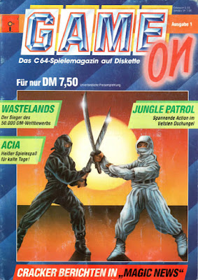
CoverGame On's logo is quite a stylish affair which makes Magic Disk 64's computer-generated version from the same time period look somewhat dull in comparison.
I think from a distance the cover art looks fine. The colors are quite striking, and the elements are easily recognizable. But as soon as you take a closer look, the picture falls apart.
Obviously, those are two ninjas locked in a sword fight, because ninjas are cool, right? The image also suggests that one of the games on this disk is a fighting game, which is very much true for Wastelands.
But what is the ninja dude in white doing with his left hand? Did he want to grab his sword with both hands, but then had a change of mind in mid-motion? What's more, the back of his right hand is rubbing against black ninja's blade. That can't be healthy for long.
As for the white ninja's left hand, I think I have a good idea what happened there: The artist wanted the ninja to hold the sword in both hands, but then realized that the pose made it impossible for the left arm to reach the hilt without looking unnaturally long. At that point, it was probably too late to start over and change the pose, so the artist drew the ninja's left hand as if it were awkwardly touching the right arm's sleeve.
Not that I noticed any of this when I bought the magazine as a kid. I thought it looked simply awesome.


